What is Color Theory in Graphic Design?
In graphic design, almost nothing is more essential than understanding color theory. A color may evoke one emotion in a person while it may carry a totally different story for someone else.
It sets the mood, creates an atmosphere, and grabs your attention. But sometimes it seems very complicated, isn’t it?
Thus, we are here to simplify color theory for you via a guide that’s very easy to follow. Our goal is to make color theory understandable to anyone without any confusion.
We will start our journey from the very basics (like understanding the color wheel), moving on to the more advanced terms (like tints, shades, and tones). We’ll also keep exploring examples and infographics along the way to make things easier for you.
What is a Color Wheel and how to draw it?
Before we start, let’s do something fun: here’s an HTML version of the color wheel we coded! Give it a spin, you’ll like it!
Done? Great! Let’s learn more about what color wheel is now.
The color wheel is a circular arrangement of different colors (also called hues) that helps in understanding the relationship of one color with another. It is also a handy tool for selecting colors whether you're working on an art piece, designing a timeless logo, or putting together an event outfit.
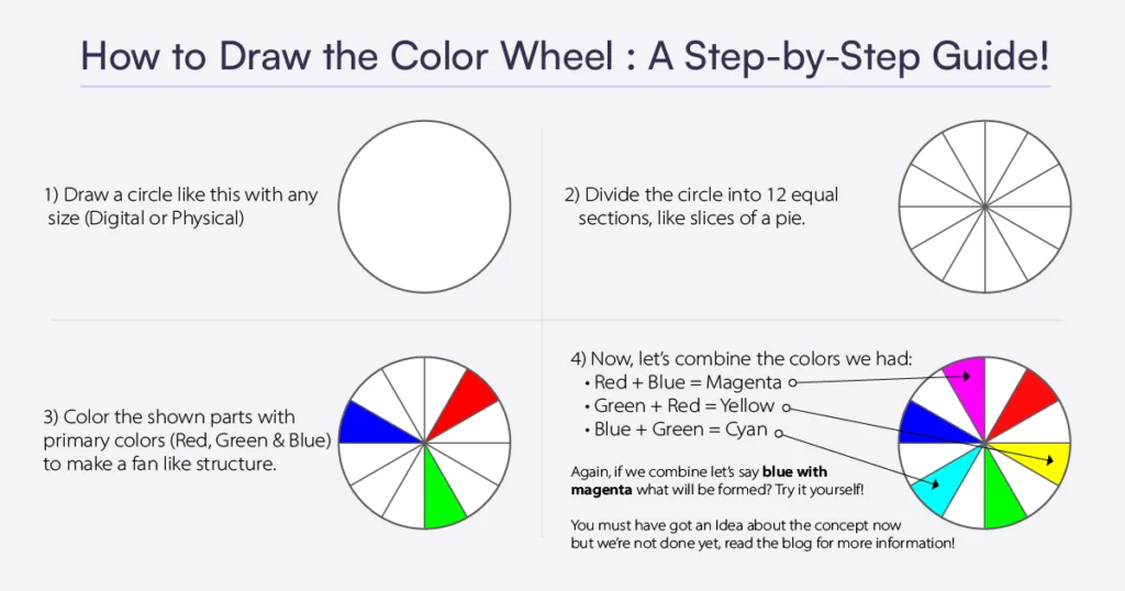
We know that you might be feeling a little lost on how to draw the color wheel. Don't worry, we've got your back! Have a look at the infographic below and learn to draw the color wheel in just 4 simple steps.

What are Primary, Secondary and Tertiary Colors?
Before moving forward, we want you to know that there are three commonly used primary color models in color theory. Artists debate on which one to use (a lot) but we are going to stick with the RGB color model for now and you don't need to remember them as it may get confusing and also not required if you're a beginner.
Following are the three color models used in color theory:
1. RGB color model (red, green, and blue)
2. CMYK color model (cyan, magenta, yellow and key)
3. RYB color model (red, yellow, and blue)
1. What are Primary Colors?
Primary colors like red, green, and blue are the basic colors that can be mixed with each other or other colors like magenta, cyan, etc to create new colors. These colors can't be created by mixing any other colors together.
For example: You want to create a red color, but can’t, why is that? Because it's actually impossible as red is a pure color on the color wheel which means that no combination of colors can create a red color. Also, if we mix two primary colors i.e., Red+Blue=Magenta is created which is also a proof that we can create new colors this way.
- Red: Red is a powerful and dynamic color that carries a lot of meanings and associations. It can evoke strong emotions such as passion, love, energy, excitement, urgency and even caution/danger.
- Green: Green is commonly associated with nature, growth, and renewal. It is the color of many living plants and represents balance and harmony. It can also be linked to wealth and prosperity.
- Blue: Blue color is often associated with trustworthiness, reliability, and loyalty, which is why it is commonly used in corporate branding. It is also known to evoke feelings of calmness, serenity, and peace. Additionally, blue is associated with intelligence, wisdom, and knowledge, possibly because it is the color of the sky and ocean, which are both vast and seemingly endless.
2. What are Secondary Colors?
Secondary colors are the colors formed by the combination of primary colors. For example - Red+Green=Yellow, here yellow is the secondary color, as simple as that. Similarly, Red+Blue=Magenta and Green+Blue=Cyan.
• Yellow: Yellow is often associated with friendliness, happiness, joy, optimism and positivity. It is a warm and attention-grabbing color which is why it is used in design to emphasize important elements.
3. What are Tertiary Colors?
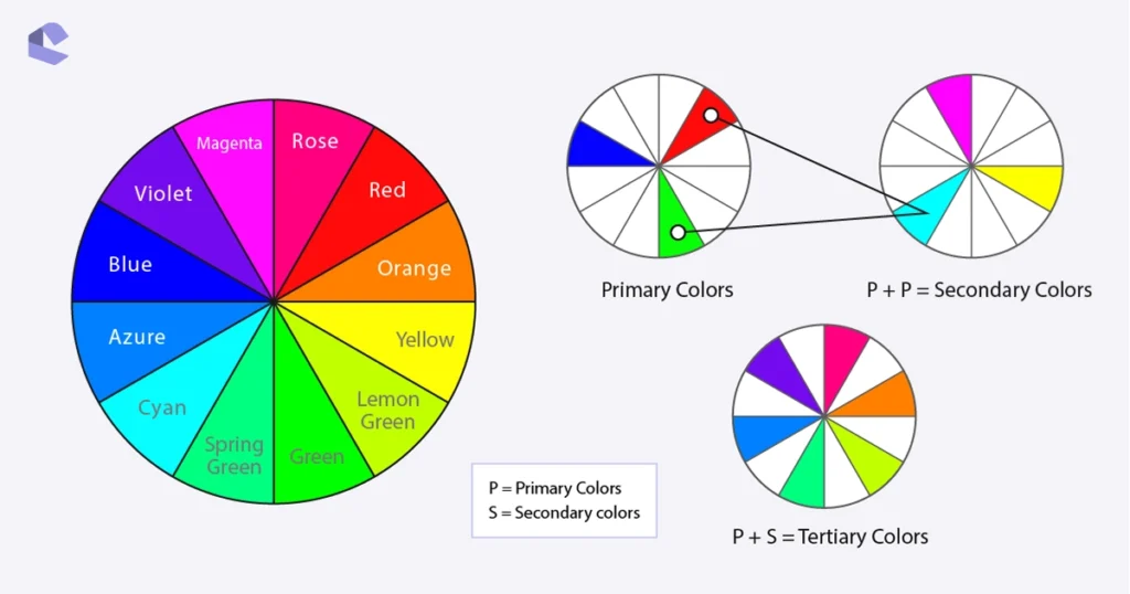
Tertiary colors are those colors which are formed after further combining primary colors + secondary colors. For example: Red+Magenta=Rose.
Still finding these concepts difficult? No need to worry. We have provided an infographic below that will further simplify these terms for you.

What are Warm and Cool Colors?
The color wheel you just saw above can be divided into two parts: on one side, we have the transition from Rose to Lemon Green (left curve), giving us the cool colors. And on the other side, we have the fiery shift from Red to Yellow(right curve), giving us the warm colors. Let's dive deeper and discuss them in detail.
1. What are Warm Colors?
Warm colors include reds, oranges and yellows. They evoke feelings of energy, passion, and warmth. They can also create a sense of excitement, happiness, and joy.
Let us ask you a question now. How do you feel when you see a campfire? You feel warm. That is exactly what warm colors are. Everything you see close to a fire or a spicy chilly is a warm color.
2. What are Cool Colors?
Cool colors evoke feelings of freshness, calmness, clarity, and relaxation. In our case, they include Rose, Magenta, Violet, Blue, Azure, Cyan, Spring-Green, Green, and Lemon Green. Overall, cool colors tend to have a soothing and refreshing effect on the viewer.
And, here's another question. How do you feel when you see a forest, or an ice-cube? You feel refreshing and cool. That is, what cool colors are. Basically, everything you see closer to blues and greens are cool colors.
Note: It's important to note that individual perceptions of warm and cool colors can vary depending on cultural and personal factors. For example, in some cultures, red may be associated with luck and happiness, while in others it may be associated with danger or warning.
What are Neutral Colors?
Neutral colors are colors that are not a part of the color wheel and are often described as being colorless. They include black, white, grey, cream, ivory and brown. These colors are often used as a base or background in design, and are typically paired with brighter, more vibrant colors to create contrast and visual interest.
Neutral colors are popular in design because they can create a calming, timeless, and sophisticated atmosphere. In branding, these colors are often used to create a sleek and professional look. They can also be paired with metallics, textures, and patterns to add depth and interest to a design. Overall, neutral colors are versatile and essential to any design toolbox.
What is The Difference Between Hues, Tones, Shades, Tints and Saturation?
Once we've helped you to know the difference between the following key terms, you'll be a color theory pro!
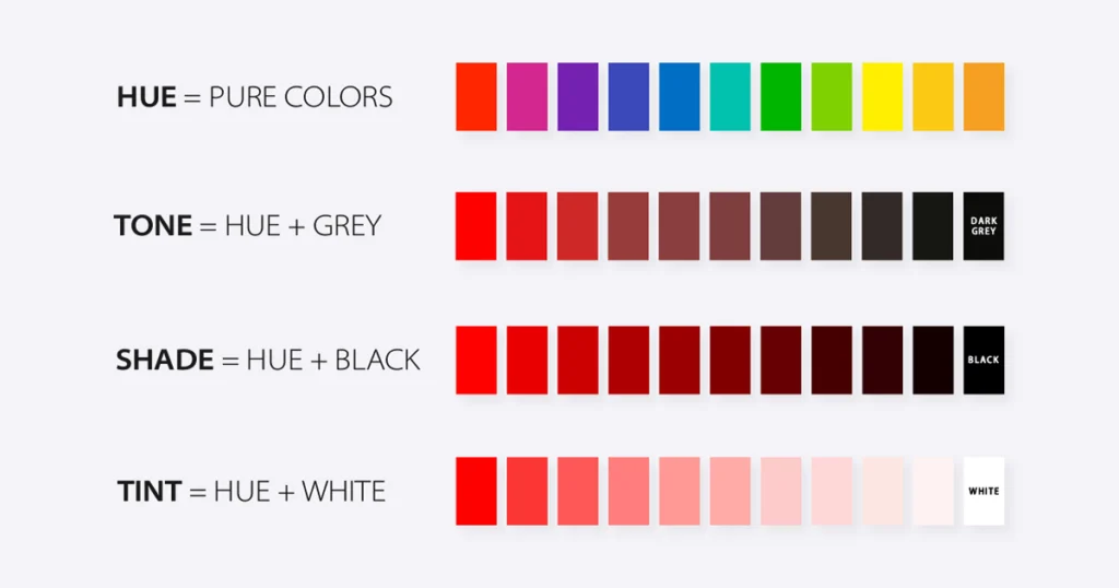
Hues: Hues are the pure colors in a color wheel with no whites, blacks, and greys added. They basically are the pure “color” of the colors.
Tone: Tones are the colors formed by combining grey with a hue i.e., Hue+Grey=Tone
Shades: Shades are the colors formed by mixing black with a hue i.e., Hue+Black=Shade
Tints: Tints are the colors formed by blending white with a hue i.e., Hue+White=Tint
Saturation: Saturation refers to the intensity of a color. A color with high saturation appears bright and vivid, while a color with low saturation looks washed out or dull. Essentially, saturation describes the intensity of a color.

We know you may have heard of color theory terms like Chroma, Intensity, Brightness, Lightness, and more, but don't worry, you don't need to learn them right now as you'll pick them naturally along your art/design journey. Just keep these terms in mind and you're good to go.
Conclusion
We know color theory can be overwhelming when you're starting your graphic design journey, but it's an important aspect of design that can make you stand out. Hopefully, we were able to simplify some information and make it easier for you.
Remember, don’t be afraid to experiment with colors and have fun with them. You won’t even realize how much you’re improving while you play around with them.
If you want to stick around, we recommend you reading our article on: Emotional Design and Why it Matters More Than You Think.
Bonus:
Book Recommendation: If you want to go into further depth and advanced methods of color theory for graphic design, you can refer to The Complete Color Harmony Book. It has everything from color pairing, trends to color psychology and more. It can boost your color theory skills by upto 80%. Yes, we have tested it ourselves!