Why Indian Street Typography Looks Nothing Like Your Design Textbook
You’re having a chai(tea) at a roadside tapri(tea-stall) and your eyes notice a row of shops.
A mobile repair store. A medical shop. A coaching centre. A restaurant pressed between two hardware stores.
The signs above them don’t look anything like the typography examples designers spent hours studying in design schools.
The letters are huge. The colors are louder than they need to be. Some words have shadows. Others have outlines. A few seem to use entirely different styles on the same board.
And yet, within seconds, you already know what most of those businesses do.
Indian street typography definitely breaks a lot of rules we learn in design school. But maybe that’s because it’s solving a completely different problem.
The rules of typography were created to help communication. Indian streets demand a different kind of communication: one that can survive noise, movement, competition and limited attention.
What looks chaotic at first is the result of businesses doing whatever they can to be seen, remembered and chosen.
What Design Textbooks Get You Used To Seeing
Ask a design student to describe good typography and you’ll hear familiar words.
Consistent. Clean. Aligned. Readable. Minimal.
Most typography education revolves around creating clarity through order. We learn about grids, hierarchy, spacing, contrast and restraint. We study airport signage, editorial layouts, brand identities and wayfinding systems where every element has a carefully planned place.
But then we step into a busy Indian market and suddenly those principles start feeling out of sync.
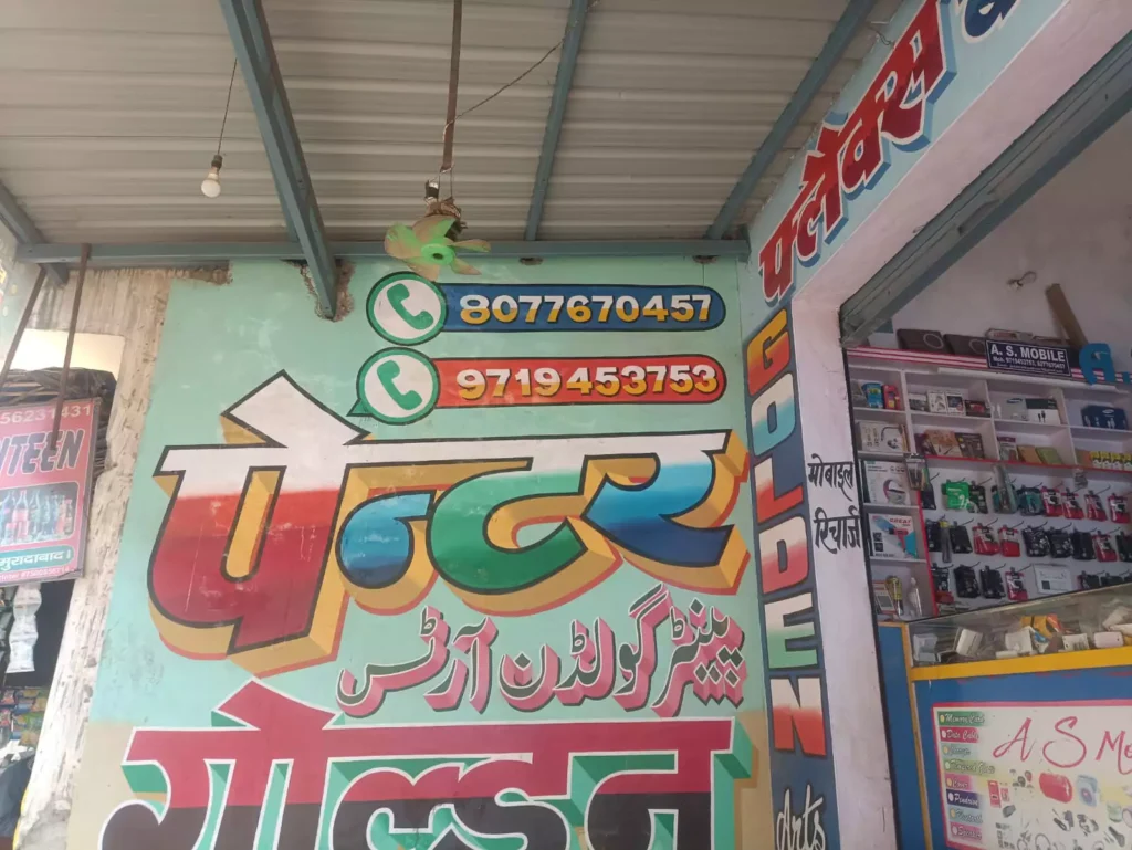
Take an example of this Indian shop sign.
A typography instructor would spend an entire class pointing out what it does “wrong”.
There are multiple type styles living on the same wall. The lettering uses gradients, shadows and thick outlines simultaneously. Three different scripts share the same space. The word “GOLDEN” runs vertically along the edge while the phone numbers sit prominently at the top. There is very little empty space for the eye to rest.
Even hierarchy feels unusual.
In many textbook examples, the business name receives the most attention while secondary information supports it.
Here, the WhatsApp logos and phone numbers compete for almost as much attention as the shop name itself.
The sign wasn’t designed for a classroom wall. It was designed for a crowded Indian street where someone might only glance at it for a second while walking, driving or sitting in an auto.
From a design textbook perspective, it feels chaotic. From a street perspective, it feels perfectly normal.
A question for you to think upon:
What if these signs aren’t failing at typography? What if they’re responding to a different set of conditions? Different audience, varied behaviours.
Because Street Signs Aren’t Competing for Beauty
One thing becomes obvious after spending time on Indian streets.
No sign wants to be the quietest there.
A shop uses red lettering. The neighboring shop adds yellow outlines. Another increases the size of the text. Someone else adds shadows. Then gradients. Then brighter colors.
Over time, an entire street begins to feel like a competitive visual storytelling where every business is trying to remain visible.
Design textbooks discuss typography in controlled environments. A poster on a wall. A magazine spread. A website interface.
Street signs specially in India don’t live in controlled environments.
They compete with traffic, sunlight, dust, electric wires, passing vehicles and dozens of neighboring businesses.
A sign isn’t asking for your full attention. It’s trying to earn two seconds of it.
That’s a completely different challenge. And different challenges usually produce different design solutions.
Why Everything Is So Big, Bold and Loud?
The first thing most people notice about Indian street typography is its visual volume.
Letters are larger. Colors are brighter. Outlines are thicker.
Everything feels amplified.
When you look at it for the first time, it can seem excessive. But stand on the road some more and the logic becomes clearer.
A thin elegant typeface may look beautiful on a laptop screen, but it can disappear against a busy urban backdrop.
A thick outline helps separate text from its surroundings.
Strong color contrast improves visibility under harsh sunlight. Large lettering remains readable from a moving vehicle.
The sign in the photo demonstrates this perfectly: The shop name dominates the composition. The phone numbers are impossible to miss. Even the WhatsApp icons have been given significant visual weight.
Nothing there is subtle. Because subtlety doesn’t help. Bold does.
Many designers associate good typography with restraint. But typography has always been about communication first. If a design helps people find, remember or recognize something more effectively, it’s doing part of its job well.
Even if it doesn’t look like the examples hanging in a design classroom.
Why One Indian Sign Speaks Three Languages at Once?
Now look at the same sign again. There’s one more challenge hiding.
It isn’t communicating in just one language. Hindi appears prominently. Urdu is present. English appears too.
This is something many typography discussions overlook.
India isn’t simply multilingual. It’s visually multilingual.
A single sign requires communicating with local residents, visitors, younger audiences, older audiences and people who are comfortable reading entirely different scripts.
Suddenly the design problem becomes more complicated.
It’s no longer just about readability. It’s about balancing multiple writing systems within the same space.
A typography book might show examples using a single language across a clean grid. A street sign doesn’t have that luxury and becomes a negotiation.
Which language gets priority? How large should each script be? How much space should be allocated to each audience?
Sometimes the result feels crowded. But that’s because the communication challenge itself is crowded.
The sign isn’t speaking to one group of people. It’s speaking to 140+ Crore Indians at once.
Why Perfect Alignment Doesn’t Matter in Indian Signage?
Designers develop a strange habit after learning about grids. Once you start noticing alignment, it’s difficult to stop.
You begin spotting uneven spacing everywhere: Shop signs, restaurant menus, billboards, product packaging.
The problem is that most people aren’t looking for those things.
When someone walks past a mobile repair shop, they’re usually asking simpler questions like: Can this place fix my phone? Where is the entrance? What’s the contact number? Have I come to the right shop?
Alignment matters. Typography principles matter too. But they matter because they support communication. They aren’t the communication itself.
That’s why some street signs continue working despite breaking rules that would immediately stand out in a design critique session.
The audience isn’t evaluating typography. They’re trying to get their phones fixed!
Before Flexies and Hoardings, There Were Sign Painters
Many of the visual habits found in Indian street typography today didn’t come from design software.
They came from paintbrushes.
Before large-format digital printing became common, sign painters shaped the visual identity of streets across the country.
Every painter had preferences like: favorite color combinations, certain ways of drawing shadows, specific styles of lettering, ways of making text appear larger than it actually was.
A lot of those influences still remain.
You can see them in decorative flourishes, in hand-drawn outlines, in letterforms that feel human rather than mechanically precise.
And maybe that’s why many older signs feel memorable. Not because they’re perfect but because they’re personal. They carry traces of the people who painted them. Almost like handwriting on an urban scale.
Something a computer doesn’t naturally create.
Is This Bad Typography or Just Different Typography?
This is usually the point where opinions split.
Some people see Indian street typography and immediately focus on what it lacks.
- Consistency.
- Spacing.
- Alignment
- Restraint.
Others focus on what it achieves.
- Visibility.
- Recognition.
- Recall
- Accessibility.
Neither perspective is entirely wrong. But maybe the more interesting question here is: What exactly are we measuring?
If the goal is to follow every typography convention perfectly, many Indian street signs will fall short.
If the goal is to attract attention, communicate quickly and help businesses stand out in crowded environments, the answer becomes less straightforward.
Good design isn’t just about rules. It’s about context.
The same typography that feels “too much” on a luxury brand’s website might be exactly what a roadside business needs.
Different environments reward different solutions.
What Indian Streets Teach Us About Typography
The longer you look at Indian street typography, the harder it becomes to dismiss it as random.
Patterns begin to emerge:
- Certain words are larger because they’re more important.
- Phone numbers often receive surprisingly high priority.
- Business names compete for visibility.
- Languages are arranged based on audience needs.
The decisions aren’t always elegant. But they usually have a reason behind them.
A valuable reminder for designers as we get too attached to how design should look (Clean, minimal, perfectly aligned, visually quiet)
Real life isn’t always like that.
People encounter information while distracted, moving, multitasking and navigating environments that are far messier than a Figma frame.
Indian street typography reminds us that design exists in the real world. And the real world rarely follows a grid.
Conclusion: Maybe the Textbook Isn’t the Whole Story
The next time you’re walking through a market, try looking up.
This time not as a designer searching for mistakes but someone trying to understand why things look the way they do.
You may still prefer the typography found in books, magazines and carefully crafted brand identities.
There’s nothing wrong with that. But you might also begin to appreciate something else: The attention grab hidden beneath the gradients, the prominence due to shadows, or just oversized lettering to emphasis on phone numbers.
Call it chaos if you want. But remember, this chaos didn’t appear by accident. It was shaped by busy streets, competing businesses and the need to communicate with people who might only look for a few seconds.